What the Best Therapy Website Designs Have in Common
If you look at the therapy websites that consistently attract new clients through Google, a pattern emerges. It is not about a particular color palette, a specific layout, or a certain aesthetic. The practices that fill their schedules through organic search have websites that share something much more specific than a visual style.
I am Natalia Maganda, a web designer and SEO strategist who works exclusively with therapists and private practice owners. I have built and analyzed enough therapy websites to know that the difference between one that grows a practice and one that looks good while staying invisible is almost always structural, not visual. This post breaks down what the best ones actually have in common, from the surface level that clients immediately notice to the architectural layer most therapists never see.
What Clients Notice First: The Surface Layer
The visible elements of a therapy website are real and they matter. When someone lands on your site, the first few seconds determine whether they stay or leave. The therapy websites that convert visitors into inquiries consistently get a few things right on the surface.
Copy that speaks to the client, not about the therapist. The most common mistake on therapy websites is leading with credentials and clinical language. The best therapy websites lead with the client's experience. They name the pain clearly. They describe what it feels like to be stuck in the situation the client is already in. The first paragraph a visitor reads should make them feel seen before they know anything about the therapist's background.
A photo that feels like a person, not a headshot. The best therapy websites feature photos that feel warm and approachable rather than formally professional. Clients are evaluating whether they could sit across from this person in a difficult moment. A photo taken in natural light, with a genuine expression, in a real setting converts better than a studio headshot every time.
A clear next step on every page. The best therapy websites make it immediately obvious what to do next. A phone number in the header. A contact form that is never more than one click away. A clear call to action that tells the visitor exactly what reaching out looks like. Practices that bury their contact information behind multiple clicks lose inquiries that were ready to happen.
Mobile experience that does not make people work. More than half of therapy website visitors are on a phone. The best therapy websites load quickly on mobile, display text at a readable size without zooming, and have contact buttons large enough to tap without frustration. A site that requires pinching and scrolling on mobile loses clients before the copy even has a chance to work.
What Most Visitors Never See: The Structural Layer
This is where the best therapy websites diverge most significantly from the ones that look professional but produce no results. The structural layer is invisible to the casual visitor but entirely visible to Google, and it is what determines whether anyone outside your existing referral network ever finds you.
More pages than most therapists expect. The therapy websites that rank and convert consistently are not five-page sites. They are 20 or more page sites that were architected from the beginning to cover every specialty, every relevant geography, and every major question a future client might ask. Each page is a separate ranking opportunity and a separate entry point into the practice. A five-page site is competing for five searches. A 20-page site is competing for twenty or more, and each of those pages compounds in authority over time.
Individual pages for each specialty. The best therapy websites treat each specialty as its own page, not as a bullet point on a general services page. A dedicated anxiety therapy page ranks independently for anxiety-related searches. A dedicated EMDR page ranks independently for EMDR searches. A dedicated trauma therapy page ranks independently for trauma searches. The practices that rank for their specialties have given Google a specific, dedicated page to associate with each one. The practices that have a single services page listing everything they offer are not ranking specifically for any of it.
Location pages that claim geographic territory. The therapy websites that dominate local searches have built pages specifically for every city, suburb, and nearby area their practice realistically serves. A homepage ranks for the main city. Location pages rank for everything else — the neighborhoods, the suburbs, the nearby towns where potential clients live and search but where a homepage alone cannot reach. For virtual practices, this means individual pages for every major city in the state, turning a single-location practice into a statewide presence.
A blog that flows authority downward. The best therapy websites treat the blog not as a place to share thoughts but as infrastructure. Each post is written around a specific search query, published consistently, and linked deliberately back to the specialty and location pages that need authority. A blog that publishes twice a month for a year produces 24 posts, each one passing relevance and authority to the pages doing the commercial work. A blog that published four times a year ago and has not been touched since is not producing that effect.
Consistent signals everywhere Google looks. The best therapy websites are backed by consistent citations across every directory where a practice can be listed, a complete and active Google Business Profile, and a technical foundation that loads quickly and can be crawled without errors. These are the supporting signals that tell Google the practice is real, active, and trustworthy. They are not glamorous, but the practices that skip them are invisible in local search regardless of how well-designed their homepage is.
The Pattern That Separates Good-Looking From Actually Working
The therapy websites that book clients are not the ones that look the most impressive in a portfolio screenshot. They are the ones where every layer — surface, structural, and ongoing — is built intentionally and working together.
The copy attracts the right client and converts the visit into an inquiry. The design creates an environment where someone in a vulnerable moment feels safe enough to reach out. The page architecture gives Google dozens of specific, relevant pages to rank across the therapist's specialties and geography. The blog compounds authority month over month. The citations and Google Business Profile anchor the practice in local search.
When all of these layers are present and aligned, the website does not need the therapist to constantly market. It works on its own, around the clock, bringing in the right clients while the therapist focuses on the ones already in their caseload.
When any of these layers is missing, the result is a website that looks good in screenshots and produces nothing in the form of new client inquiries.
How to Look at a Therapy Website With the Right Eyes
Most therapists evaluate therapy websites the way a client would: does this feel like me, does it feel warm, does it feel professional. These are necessary questions, but they are not sufficient ones.
The additional questions worth asking: How many pages does this site have and what are they for? Can you find location pages for nearby areas? Are there individual specialty pages or a single catch-all services page? When was the blog last updated, and does it link to the service pages? Is there a Google Business Profile backing this site?
These are the questions that reveal whether a website is built to grow a practice or built to look like it is.
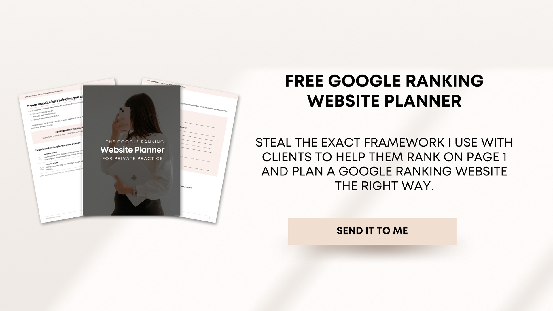
If you want to understand what a properly structured therapy website looks like from the inside, the approach behind every web design for therapists and private practice owners project I take on is the right place to start. And if you are ready to talk about what an ongoing SEO strategy for your private practice looks like built on top of that foundation, that is the next step.
🚨For a limited time we are offering FREE SEO strategy clarity calls
I mean I get it. Booking a call is scary when you're considering options or not quite sure if me, a complete stranger you just met on the internet is worth your time or not, which is exactly why I want to save you your precious TIME and sanity. I could be selling you an online course right now. I could be pitching you my service, but instead I'd prefer you have a free SEO strategy session with a real human so that you can understand if SEO is worth your time or not.
The commitment? Yes a call on your calendar.
The worst case scenario? We part ways and you have a free strategy, a PDF and got all your SEO questions answered.
Either way, you win! 🤍🥂
* AI Disclosure: This content may contain sections generated with AI with the purpose of providing you with condensed helpful and relevant content, however all personal opinions are 100% human made as well as the blog post structure, outline and key takeaways.
* Affiliate Disclosure: Some of the links on www.nataliamaganda.com may contain affiliate links meaning that I will get a commission for recommending products at no extra cost to you.

hello! i'm natalia maganda
The go-to website designer and SEO manager for therapists and private practice professionals that you didn't know existed
After designing 100+ websites for women in many industries, I ended up in the healing world because I believe in the power of emotional work and in supporting the people who support everyone else. Now, I’ve built an online presence that allows me to have more
time to spend with my family, more
income working with fewer clients and
less stress with sustainable marketing systems! And that’s exactly what I want for you. We manage 20+ websites and I’m ready for you to be the next one.